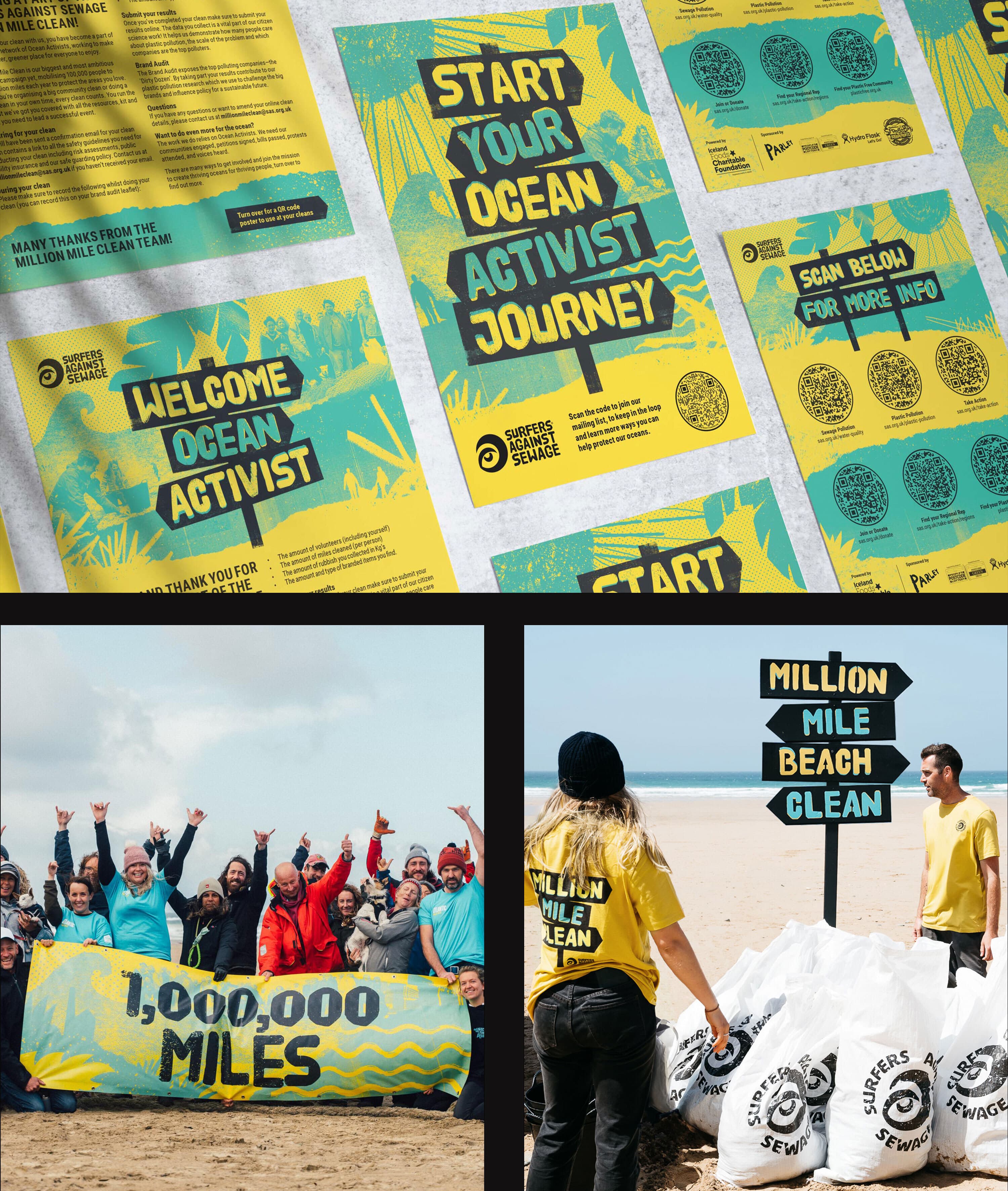
Million Mile Clean branding by Will Kinchin at Will Works
Surfers Against Sewage (SAS) hosts beach cleanups in Cornwall annually, but they turned their attention to a more ambitious goal: expanding the effort nationwide to organise the largest clean-up event in the UK, and possibly Europe. They launched the Million Mile Clean, calling on each of their 100,000 members to cover ten miles of beach, street, mountain, or river. Will Kinchin of Will Works created a brand for them, that physically connects with the environment (see the amazing sand art by creative team Sand in your Eye, below!) and inspires positive change. We talked to Will about his journey from being a rollerblading graphic design student to becoming a surfing studio owner and how he has used his creative talent for philanthropy.
Gnarly but Nice
Will Kinchin
What started your journey into the creative industry?
In school, the only things I seemed to be any good at were art and rollerblading. My maths skills were as wobbly as my first attempts at a 360 spin. I was as captivated by the graphics and brands as I was by the skating itself. Among them, a rollerblading company called Mindgame stood out, with its clean, clever, and minimalist designs, setting it apart from the rest of the scene. Inspired, my friend and I created our own skate brand and logo. This was long before I even knew that branding was a thing. We were just young, excited, and inspired.
College allowed me to expand this creative pursuit, adding photography and media to my skill set. Then during an art foundation course, my tutor introduced me to this brilliant thing called graphic design—a field where I could merge my love for art, photography, and illustration. Who knew doodling in the margins could turn into a career? This revelation led me to study Graphic Design at Falmouth University, where my eyes were opened even wider to the creative world. I also swapped my skates for a surfboard, continuing my extreme sports journey in the ocean. It was during this time that I became acutely aware of the issues facing our coasts and oceans, realising that graphic design could be a powerful tool for change.
After university, I joined the London exodus, dusting off my skates to zip around the city. I landed a placement that turned into a job at a quirky little branding agency called HGV (Halpin Grey Vermeir). With a tiny team of three, I got to wear many hats and learn the ins and outs of running a studio. I gravitated towards smaller, more creative studios throughout my career, which is probably why I’ve kept my own studio small and nimble.
Could you share the pivotal career moments that have led you to your current success?
In my first London summer after moving up from Cornwall, I missed the coast – the laidback lifestyle and, most of all, surfing. Surfing gave me an appreciation for the beauty and wonder of the natural world, as well as a front-row seat to the harsh realities of plastic pollution and sewage. One evening, a mate and I headed over to Carnaby Street for a talk by Surfers Against Sewage (SAS) in the old Howie’s surf shop. We wanted to learn more about their work and hang out with some other like-minded surfers and nature lovers.
Inspired, we introduced ourselves to Hugo Tagholm, the CEO at the time, and offered our design skills to help their cause. We were broke but realised that what we couldn’t give with our pockets we could give with our talents. This philosophy has become a core pillar of my approach to business and charitable giving. We started off designing T-shirts and a poster for a campaign to protect a wave threatened by a new MOD firing range. The campaign was a hit and kept the wave accessible, benefitting local businesses reliant on surf tourism. For the surfers reading, the line was “Stand up for your rights and lefts” with an illustration of a surfer standing in front of a tank. This led to many lunch break, evening, and weekend projects over the years, one of which was to rebrand the charity.
After travelling the globe and refining my skills in some of London and Sydney’s top branding studios, my partner and I settled back in Cornwall. I reconnected with Hugo over a coffee and a surf and offered my services at a discounted rate. He was stoked that I’d set up a studio in the southwest, and shortly afterwards my first project was branding the Plastic Free Awards. A job covering brand, print, motion, sound, merch, staging, and product design. It was a big success and ran three times over five years, leading to many other projects. Although Hugo has moved on, and is now at the helm of Oceana UK, I’m still helping to protect our oceans and waterways with SAS…and now Oceana too.

* Sand Art: Sand In Your Eye * Photography © Richard McCarthy/PA
How were you instructed to work on this particular brand?
Every year SAS hosts beach cleans around Cornwall, but they had a grander vision: take it nationwide and rally their vast network of grassroots activists to create the UK’s, and possibly Europe’s, biggest clean-up event. They called it the Million Mile Clean, urging each member of their 100,000-strong network to clean ten miles of beach, street, mountain, or river. Think of it as a fitness challenge with the added bonus of saving the planet.
Partnering with Strava to calculate the distance, they aimed to tally one million miles over the year. Initially, we were tasked with creating a pitch deck to attract sponsors. Our deck hit the mark, securing Iceland supermarket as the primary sponsor, along with other supporters. With funding in place, we were asked to design and roll out a full campaign identity.
What core message did you aim to communicate through this brand’s identity?
Together we can safeguard millions of miles of beach, river, street and mountain, by pointing out the worst polluters and demanding polluting industries change direction.
“We don’t seek inspiration–we listen out for it.”
Where do you usually seek inspiration when crafting a brand’s message?
We don’t seek inspiration–we listen out for it. Our ideas often spark from a good old chat. Every project kicks off with an immersion stage, diving deep into the client’s world with a Q&A that results in rambling, beautiful conversations. Next, we host a visual look-and-feel workshop, drawing from these conversations to explore the sector, competition, likes, dislikes, and potential directions. We dig deep, turning over every stone and following every twist and turn, asking more questions to uncover a unique core thought. This core thought shapes a creative strategy that inspires a visual and verbal language, communicating the heart of the brand, campaign, or in this case, movement.
From there we research, play, experiment, and explore both in and out of the studio. We collaborate, chat more, make mistakes, make magic, make coffee. We take a walk, get lost, discover new paths, and see where the journey takes us. It’s an exhilarating, hectic yet wonderful part of our work that evolves with every project, allowing us to look far and wide and be fully immersed in the subject.
How many concepts were presented, and how did you navigate the design process?”
We shared four concepts for this campaign. Each route had its own creative strategy and visual flair to convey the core messages. This first concept was rooted in numbers, weaving mileage seamlessly into the typography. The second drew inspiration from the raw ripped-up scraps of old weathered packaging. The third was a kooky character-driven approach featuring a whimsical 1950s-style illustrated hand with legs. Yes, legs. This hand was on a mission, guiding volunteers through the story and literally pointing fingers at polluters. Time was tight—we had just six weeks to design the campaign and launch the initial assets. Thankfully, SAS had faith in my creative instincts, and the final identity wasn’t a million miles away from the original concept we presented.
What did you find most challenging about bringing this brand to life?
This project threw us a few curveballs. First off, it had to resonate with the Surfers Against Sewage (SAS) brand while also standing out as a unique movement that companies and organisations could rally behind. The SAS brand is flexible, but striking the perfect balance was tricky.
The biggest challenge, though, was that most of the year-one work happened during lockdown. The SAS team planned the launch for when people could return to our blue and green spaces, as restrictions lifted and warmer weather heralded the bathing season. After nearly two years of heavy COVID imagery, messaging and stats, we needed an identity that was positive, energetic, and light-hearted, inspiring people to reconnect with the environment and community. We had to avoid negative visuals like unsettling statistics or images of dead sea creatures and trashy beaches. At the same time, we needed to communicate the enormity of the problem and create something raw and gritty, true to the SAS core brand.
On a side note, we had just had our first son, who often dozed in my home studio beside me. As wonderful as that was, it made focusing a bit challenging.

* Sand Art: Sand In Your Eye * Photography © Richard McCarthy/PA

* Sand Art: Sand In Your Eye * Photography © Richard McCarthy/PA
In your view, what elements make a brand’s identity stand out and stick in people’s memories?
For me, it’s all about weaving a simple idea effortlessly through every detail of a brand, from the core elements like logos, signage, and posters, down to under-appreciated sidekicks like favicons, barcodes, and error messages. Those clever, often-overlooked details are what stick with me, adding a pop of unexpected joy. I vividly remember flipping over an Innocent Smoothie bottle back in the early 2000s, only to find “Stop looking at my bottom” printed on the bottom. Brilliant! It’s those little quirky touches that create a memorable experience, get people smiling, and make a brand unforgettable.
“… tackle every task with passion and an open mind”
What advice would you offer to budding creatives aspiring to break into the industry?
Be passionate, even when you’re handed a rubbish task. As a junior designer midway through my probation at a London agency, the creative director asked me to tidy the basement. The basement was a designer’s apocalypse—books, paper samples, mock-ups, swatches, and more clutter than you could shake a Pantone guide at. Instead of feeling deflated and doing the bare minimum, I embraced the task with enthusiasm.
I organised the books, cleared some studio shelves, and created a new library. This let me design all the signs and labels for categorising the books. I even ordered wooden boxes for the paper swatches and designed labels to sort them by supplier. Plus, I chucked out loads of old junk. Years later, over a pint, the creative director brought up this task. He admitted he felt bad assigning it to me. He wanted to give me more inspiring projects, but I was the only free person at the time. He said he was relieved that not only did I eagerly take on the rubbish task with passion and energy, but transformed it into a design project. He said it gave him so much confidence in me, that he made sure the next nice job in the studio came my way. That project was an identity for a small South London pub, which won an Art Directors Club cube and earned me a trip to New York.
So, tackle every task with passion and an open mind—you never know where it might take you. And if all else fails, at least you’ll have a spotless basement.
Is there a ritual you have before starting a project?
First panic. Then remind myself I’ve been doing this for over 16 years. Then panic some more. I guess the imposter syndrome never goes away.
During a tea break, what are you dunking?
I’ve had to put a pause on my dunking habit. My biscuit addiction was spiralling out of control. One evening, I devoured nearly an entire pack of my placement’s biscuits after she went home. I then spent the rest of the night feeling guilty, and I had to get in early the next morning to replace the evidence.